
Copy 2.0 Smart

Copy 2.0 Hybrid Smart Sales Page (Image Version)

The Highest Converting Long-Form Sales Page You've Ever Built

Tired of Having This Annoying Problem?

  • In this top section, emphasize a big problem or frustration that your audience has.
  • This is a problem that your product will solve for them, of course.
  • However, at this point, we're not talking about the product yet. Think of it as telling a story, where you don't want to rush to the ending right away.

Hi, I'm Shane. Give the page a personal touch by adding your image below
and introducing yourself with a short sentence.

This Sub-Heading Has One Job: Make Your Visitor Want to Keep Reading!

This is a "Hybrid" long-form sales page where we combine the best qualities of classic long-form sales letters with some visual aspects that the most successful online sales pages make use of. At this stage of the page, we want to arouse the reader's curiosity, so they want to keep reading.

If you use the page well, there will be a lot of text and a lot of content. And that's a good thing: it gives you the opportunity to tell a story, connect with your reader and explain your offer in great detail.

But no one wants to read that much text! If that's something you're worried about with a sales page like this, keep in mind that the closer someone gets to making a purchase decision, the more likely they are to hunt for specific information. Your most valuable prospects are more likely to leave when there's not enough information than if there's too much

By the way: short paragraphs and highlight boxes like the one above are a great way to keep the text light and easy to read. Don't overwhelm your visitors with a "wall of text".

Use Sub-Headings Like this One Frequently. Makes Your Page "Skim-Friendly".

Some of your visitors will be readers and others will be scanners. The readers will start at the top and read every. single. word. until they reach the end of the page (or until they can't wait any longer and decide to buy). The scanners, on the other hand, will skip about looking for things that catch their attention.


Keep in mind: the scanners want to be convinced just as much as the readers do, they are just looking for information in a different way.


What you're reading right now a text block consisting of a heading and a section of text. Break up all of your content into blocks like this to make everything easier to read, easier to understand and easier to navigate. You'll also notice that none of the paragraphs here are more than 4-5 lines high (on a large screen, anyway. Yes - this page is fully mobile responsive).

Don't Jump to the Sale too Quickly: Long Form is All About Building Rapport

This dark background is another way to create visual variety on your page and keep it interesting. If you use a dark background with light text, keep it short. Light text on a dark background is harder on the eyes than dark text on a light background.

The Simple Storytelling Rule for Sales: Convince First, Sell Second!

Remember that long form sales pages are about relating to your reader. Don't jump right in and start talking about your product.


Instead, tell a story. Write about how things feel. Write about problems, frustrations, experiences, triumphs. Think about a movie or TV series - it's all about the characters and how much you care about them. And you only care about them if you can relate to them.

Trying to sell too soon is the most commonly made mistake - not only on long form sales pages. Even if your page is short and visual, without relating to your customer, you can't make sales.

Also remember that what you're looking at is only a template. Maybe you want to spend more time on the story. Maybe you want to add several more headline + text blocks, to really elaborate and evoke emotions. With Thrive, you can easily do so (just duplicate some of the existing blocks). Let the template inspire you, but don't let it limit you.

Using Image Sections to Add a Visual Element

Below is an example of a simple image section: use images or icons to illustrate a point you're making. This can assist in your story telling or be used to showcase features (although only if you use it further down the page, after the product reveal).

Keep it simple. You can use the icon feature in Thrive Architect for the images.

Don't over-explain in these text sections below each individual image.

Let the images do the talking. If something needs more explaining, add a text block below.

Get Your Points Across by Using Lists

  • Create a nice list of points here.
    What are the points about? Anything you want. This could be a summary of the page so far, for example (remember those scanners?).
  • Make your content easy to digest.You can think of the layouting/formatting task on a sales page in this way: the goal is to present nice, appetizing, bite-sized morsels for your reader. Don't hit them over the head with big words or long paragraphs. Make it easy and fun to experience your sales page.
  • Once you know this, you'll want my product.That's the result you should aim for with your content. Once your reader understands the story and all the points you've made, they will truly understand the value of your product (or service, or whatever you're selling).

In this Text Block, Start Transitioning to the Solution You're Offering...

You've set the scene. You've captured your visitors' attention. You've related to them and told them everything they need to know to truly understand what your product is about. Now it's time to start introducing them to the product.

Keep one thing in mind: your product is the solution. At first, don't talk about it in terms of a product. Talk about how you found a solution and about how this same solution can help others too. Why do all this? Because if you set it up right, you will be the opposite of the slimy, used car salesman stereotype we all despise... you will not be pushing product, you'll be doing everyone a favor.

Here is a Smaller Sub-Heading for Extra Emphasis

Try mixing paragraphs with sub-headings of two different sizes (H2 and H3). You can use smaller sub-headings like the one above to make an important point or for quotes that relate to your story.

Ever notice how non-fiction authors love to use quotes throughout their books? That's because quotes are a nice change of page and they lend authority and gravitas to what you're saying.

Similarly, you can use subtle text highlights, text boxes, short paragraphs, sub-headings and other text formatting to draw your reader's eye to important parts of the text. This also helps break up the page, to prevent wall-of-text-syndrome.

This is Where the BIG REVEAL happens

Here it is: YOUR PRODUCT NAME

Now it's time to present your offer as the perfect solution to everything you've been talking about so far in your story.

While we were holding back before, it's now time to be very specific. Talk about your product, what it is, what your customer gets when they purchase. At this point, after all the buildup, your readers really want to know what you have to offer, so don't hold back.

  1. 1
    Show a product image: it's always a good idea to have a visual representation of your product. It makes it more tangible and more "real" in your reader's mind.
  2. 2
    The power of the points list: use this list to emphasize the most important benefits of your product.
  3. 3
    Benefits over features: for every feature your product has, try to translate it into a benefit (i.e. a positive end-result your customer will get).
Product Name
Product Name

What People Are Saying About Our Solution

“Social proof comes with customer testimonials.”

"Customer testimonials are a powerful conversion element. Display them here to demonstrate that your product has many customers and that those customers are very happy with their purchase.


We like to do what many others have done already. There's safety in numbers. Testimonials can be used to give your visitor that sense of safety."

Shane Melaugh
- Job Title or Role

“Here's what the perfect testimonial looks like..."

“The perfect testimonial looks a lot like this one: it has a heading (this shows the best part of the testimonial), one or two paragraphs of text, an image, a name and (optionally) a role to go along with the name. Also note the use of quotation marks in the testimonial text."

Samantha Allen
- Job Title or Role

“Can you ever have too many testimonials?"

“It's a fair question: can you have too many testimonials?


The answer is: you can, but the problem is usually not the amount but the quality of the testimonials. If you have good, enthusiastic and real testimonials that mention specific details and benefits, don't shy away from adding 10, 15, 20 or even more to the page.

Just don't add a ton of boring or generic testimonials.
"

Shane Melaugh
- Job Title or Role

Welcome to the Main Purchase Section

Here we have a highly attractive purchase section. We display another paragraph of text, which is a strong call to action to your readers. In addition, we have a product image, unmissable large button and some guarantee and safety symbols.

Product Name
Product Name

100% Satisfaction Guaranteed

Secure Payment

A Few More Testimonials to Prove it Works for Real People

“Keep displaying testimonials for social proof."

“Here, we have a second testimonials section, right after the purchase section. Now that we've asked the reader to pull the trigger, they might feel some resistance and testimonials can help reassure them.”

We like to do what many others have done already. There's safety in numbers. Testimonials can be used to give your visitor that sense of safety.
"

Shane Melaugh
- Job Title or Role

“Pick the right kinds of testimonials to show here..."

“If you have any testimonials that include stories of how a customer had some doubts about your product, but was then won over by the high quality, your friendly support etc. those are perfect for displaying in this area of the sales page."

Samantha Allen
- Job Title or Role
Shane Melaugh

Creator of [Product Name]

About the Author

When selling online, it's easy to forget that people prefer buying things from other people. If there's any element of personal branding in your product, use this section to write a few paragraphs about yourself.

Keep it short, as this page is about your product, not your life story. But a few personal details mentioned here can help build rapport with your reader. It's a reminder that there's a real, trustworthy person behind this product and they aren't buying from a faceless corporation.

It's Time to Start Addressing Your Visitor's Last-Minute Objections

After the first call to action, use testimonials, case studies, more points lists and more text blocks to address all possible objections your visitors may have. Knowing these objections is very important... and you can learn all about them by talking to your customers and visitors. Give them a way to communicate with you and you'll quickly learn what's on your reader's mind as she goes through this page.

This part of the sales page can be a lot longer than it is in this template. There may be many objections that come up and you can address them all. If you dedicate a separate text block or a sub-heading to each one, your visitors can easily find the ones they have on their minds and skip the rest.

Use Sub-Headings Before Every Major Objection You Address

People are risk averse. We dread making a mistake and wasting our time and money on something that turns out to be rubbish. This is the part of the sales page where you can appease all those worries. One of the most important things you must learn about people in your market is what kinds of objections they have, so that you can effectively address them here.

Advantages vs Disadvantages

Here's a section that you can use for many purposes. For example, you can use it to showcase how your solution is better than other solutions out there. Or, compare the problems your reader is facing right now with the great solutions they'll enjoy once they purchase.

The Pros List

  • Proin arcu nulla, varius sit amet ligula ut, porta convallis dui.
  • Nullam feugiat est porta, semper felis iaculis, luctus nisi.
  • Aliquam ac ipsum convallis, dignissim lacus ut, maximus enim.
  • Phasellus nec arcu non augue egestas
  • Duis accumsan, dui et semper

The Cons List

  • Proin arcu nulla, varius sit amet ligula ut, porta convallis dui.
  • Nullam feugiat est porta, semper felis iaculis, luctus nisi.
  • Aliquam ac ipsum convallis, dignissim lacus ut, maximus enim.
  • Phasellus nec arcu non augue egestas
  • Duis accumsan, dui et semper
Product Name
Product Name

Here's a "What You Get" Section (Plus the Second Call to Purchase)

  • Vivamus sit amet lacus eu odio lacinia efficitur venenatis quis tellus. Ut eget
  • Sed egestas diam vel iaculis dapibus.
  • Fusce tortor lorem, fringilla et tortor
  • Pellentesque non facilisis purus, id
  • Facilisis purus, id lorem ipsum ultrices
  • Ultrices erat nubia nostra himenaeos.

100% Satisfaction Guaranteed

Secure Payment

100% Satisfaction Guarantee

You are fully protected by our 100% Satisfaction-Guarantee. If you don't get [a specific benefit that your product promises] by [a specific span of time in which you guarantee your product to yield results], just let us know and we'll send you a prompt refund.

Frequently Asked Questions

Why add an FAQ section like this?

How about adding a contact link?

What about exit intent lightboxes?

What questions belong here?

Have you tried a chat widget?

Answer questions, save space.


P.S.: Welcome to the post script section of the page. You can have one or several of these. This part is all about loss aversion. Here is where you can remind your reader that if they don't jump on this opportunity right now they will be missing out.

After the post scripts, use the link below to link to your purchase section or the checkout page.

Copyright - Your Company
Read More
Copy 2.0 Smart

Copy 2.0 Smart Email Confirmation Page

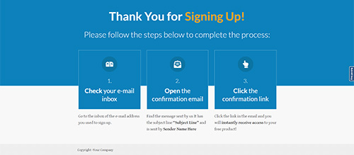
Thank You for Signing Up!

Please follow the steps below to complete the process:

1.

Check your e-mail inbox

Go to the inbox of the e-mail address you used to sign up.

2.

Open the confirmation email

Find the message sent by us It has the subject line “Subject Line” and is sent by Sender Name Here

3.

Click the confirmation link

Click the link in the email and you will instantly receive access to your free product!

Copyright -Your Company

Read More
Copy 2.0 Smart

Copy 2.0 Smart Download Page

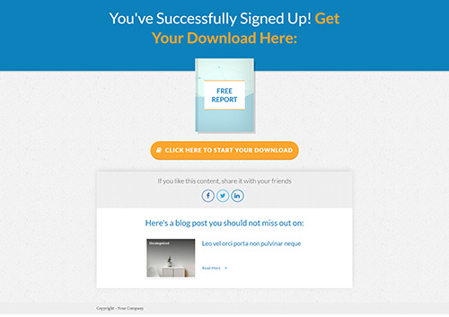
You've Successfully Signed Up! Get Your Download Here:

free report

If you like this content, share it with your friends

Here's a blog post you should not miss out on:

Copyright - Your Company

Read More
Copy 2.0 Smart

Copy 2.0 Smart Lead Generation Page

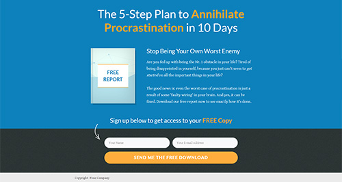
The 5-Step Plan to Annihilate Procrastination in 10 Days

free report

Stop Being Your Own Worst Enemy

Are you fed up with being the Nr. 1 obstacle in your life? Tired of being disappointed in yourself, because you just can't seem to get started on all the important things in your life?

The good news is: even the worst case of procrastination is just a result of some 'faulty wiring' in your brain. And yes, it can be fixed. Download our free report now to see exactly how it's done.

Sign up below to get access to your FREE Copy

Copyright -Your Company


Read More
Copy 2.0 Smart

Copy 2.0 Smart Product Launch Page

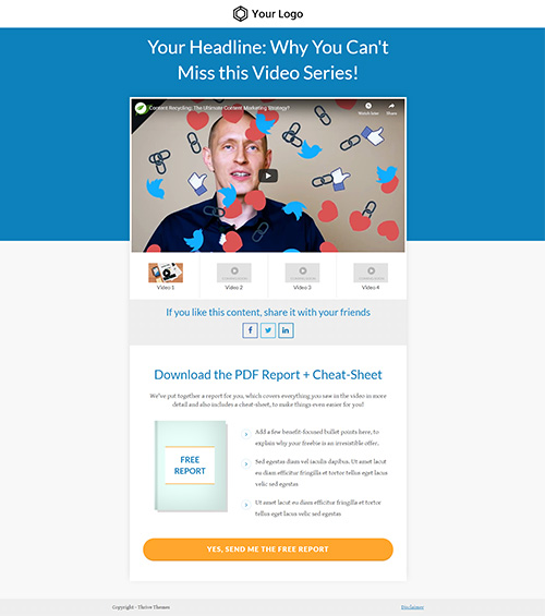
Your Headline: Why You Can't Miss this Video Series!

Video 1

Video 2

Video 3

Video 4

If you like this content, share it with your friends

Download the PDF Report + Cheat-Sheet

We've put together a report for you, which covers everything you saw in the video in more detail and also includes a cheat-sheet, to make things even easier for you!

free report

  • angle-right
    Add a few benefit-focused bullet points here, to explain why your freebie is an irresistible offer.
  • angle-right
    Sed egestas diam vel iaculis dapibus. Ut amet lacut eu diam efficitur fringilla et tortor tellus eget lacus velic sed egestas
  • angle-right
    Ut amet lacut eu diam efficitur fringilla et tortor tellus eget lacus velic sed egestas

​​​​Copyright - Your Company

​​​​

Read More
Copy 2.0 Smart

Copy 2.0 Smart Coming Soon Page

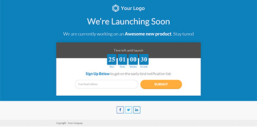
We’re Launching Soon

We are currently working on an Awesome new product. Stay tuned

Time left until launch
00
Days
23
Hours
38
Minutes
35
Seconds

Sign Up Below to get on the early bird notification list:

Copyright - Your Company


Read More
Copy 2.0 Smart

Copy 2.0 Smart 2-Step Lead Generation Page

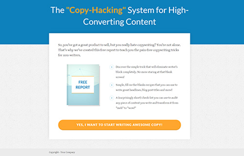
The "Copy-Hacking" System for High- Converting Content

So, you've got a great product to sell, but you really hate copywriting? You're not alone. That's why we've created this free report to teach you the pain-free copywriting tricks for non-writers.

free report

  • Discover the simple trick that will eliminate writer's block completely. No more staring at that blank screen!
  • Simple, fill-in-the-blanks recipes that you can use to write great headlines, blog post titles and more!
  • A (surprisingly short) check-list you can use to audit any piece of content you write and transform it from "meh" to "wow!"

Copyright - Your Company

Read More
Copy 2.0 Smart

Copy 2.0 Smart Sold Out Page

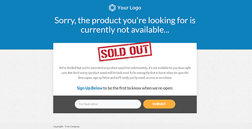
Sorry, the product you're looking for is currently not available...

We're thrilled that you're interested in (product name) but unfortunately, it's not available for purchase right now. But don't worry: (product name) will be back soon! To be among the first to know when we open the doors again, sign up below and we'll notify you by email, as soon as we release.

Sign Up Below to be the first to know when we re-open:

Copyright - Your Company

Read More
Copy 2.0 Smart

Copy 2.0 Smart Video Sales Page

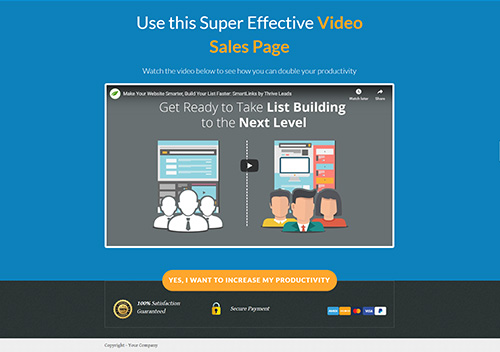
Use this Super Effective Video Sales Page

Watch the video below to see how you can double your productivity

100% Satisfaction Guaranteed

Secure Payment

Copyright - Your Company

Read More
Copy 2.0 Smart

Copy 2.0 Hybrid Smart Sales Page (Video Version)

The Highest Converting Long-Form Sales Page You've Ever Built

Tired of Having This Annoying Problem?

This Sub-Heading Has One Job: Make Your Visitor Want to Keep Reading!

This is a "Hybrid" long-form sales page where we combine the best qualities of classic long-form sales letters with some visual aspects that the most successful online sales pages make use of. At this stage of the page, we want to arouse the reader's curiosity, so they want to keep reading.

If you use the page well, there will be a lot of text and a lot of content. And that's a good thing: it gives you the opportunity to tell a story, connect with your reader and explain your offer in great detail.

But no one wants to read that much text! If that's something you're worried about with a sales page like this, keep in mind that the closer someone gets to making a purchase decision, the more likely they are to hunt for specific information. Your most valuable prospects are more likely to leave when there's not enough information than if there's too much

By the way: short paragraphs and highlight boxes like the one above are a great way to keep the text light and easy to read. Don't overwhelm your visitors with a "wall of text".

Use Sub-Headings Like this One Frequently. Makes Your Page "Skim-Friendly".

Some of your visitors will be readers and others will be scanners. The readers will start at the top and read every. single. word. until they reach the end of the page (or until they can't wait any longer and decide to buy). The scanners, on the other hand, will skip about looking for things that catch their attention.


Keep in mind: the scanners want to be convinced just as much as the readers do, they are just looking for information in a different way.


What you're reading right now a text block consisting of a heading and a section of text. Break up all of your content into blocks like this to make everything easier to read, easier to understand and easier to navigate. You'll also notice that none of the paragraphs here are more than 4-5 lines high (on a large screen, anyway. Yes - this page is fully mobile responsive).

Don't Jump to the Sale too Quickly: Long Form is All About Building Rapport

This dark background is another way to create visual variety on your page and keep it interesting. If you use a dark background with light text, keep it short. Light text on a dark background is harder on the eyes than dark text on a light background.

The Simple Storytelling Rule for Sales: Convince First, Sell Second!

Remember that long form sales pages are about relating to your reader. Don't jump right in and start talking about your product.


Instead, tell a story. Write about how things feel. Write about problems, frustrations, experiences, triumphs. Think about a movie or TV series - it's all about the characters and how much you care about them. And you only care about them if you can relate to them.

Trying to sell too soon is the most commonly made mistake - not only on long form sales pages. Even if your page is short and visual, without relating to your customer, you can't make sales.

Also remember that what you're looking at is only a template. Maybe you want to spend more time on the story. Maybe you want to add several more headline + text blocks, to really elaborate and evoke emotions. With Thrive, you can easily do so (just duplicate some of the existing blocks). Let the template inspire you, but don't let it limit you.

Using Image Sections to Add a Visual Element

Below is an example of a simple image section: use images or icons to illustrate a point you're making. This can assist in your story telling or be used to showcase features (although only if you use it further down the page, after the product reveal).

Keep it simple. You can use the icon feature in Thrive Architect for the images.

Don't over-explain in these text sections below each individual image.

Let the images do the talking. If something needs more explaining, add a text block below.

Get Your Points Across by Using Lists

  • Create a nice list of points here.
    What are the points about? Anything you want. This could be a summary of the page so far, for example (remember those scanners?).
  • Make your content easy to digest.You can think of the layouting/formatting task on a sales page in this way: the goal is to present nice, appetizing, bite-sized morsels for your reader. Don't hit them over the head with big words or long paragraphs. Make it easy and fun to experience your sales page.
  • Once you know this, you'll want my product.That's the result you should aim for with your content. Once your reader understands the story and all the points you've made, they will truly understand the value of your product (or service, or whatever you're selling).

In this Text Block, Start Transitioning to the Solution You're Offering...

You've set the scene. You've captured your visitors' attention. You've related to them and told them everything they need to know to truly understand what your product is about. Now it's time to start introducing them to the product.

Keep one thing in mind: your product is the solution. At first, don't talk about it in terms of a product. Talk about how you found a solution and about how this same solution can help others too. Why do all this? Because if you set it up right, you will be the opposite of the slimy, used car salesman stereotype we all despise... you will not be pushing product, you'll be doing everyone a favor.

Here is a Smaller Sub-Heading for Extra Emphasis

Try mixing paragraphs with sub-headings of two different sizes (H2 and H3). You can use smaller sub-headings like the one above to make an important point or for quotes that relate to your story.

Ever notice how non-fiction authors love to use quotes throughout their books? That's because quotes are a nice change of page and they lend authority and gravitas to what you're saying.

Similarly, you can use subtle text highlights, text boxes, short paragraphs, sub-headings and other text formatting to draw your reader's eye to important parts of the text. This also helps break up the page, to prevent wall-of-text-syndrome.

This is Where the BIG REVEAL happens

Here it is: YOUR PRODUCT NAME

Now it's time to present your offer as the perfect solution to everything you've been talking about so far in your story.

While we were holding back before, it's now time to be very specific. Talk about your product, what it is, what your customer gets when they purchase. At this point, after all the buildup, your readers really want to know what you have to offer, so don't hold back.

  1. 1
    Show a product image: it's always a good idea to have a visual representation of your product. It makes it more tangible and more "real" in your reader's mind.
  2. 2
    The power of the points list: use this list to emphasize the most important benefits of your product.
  3. 3
    Benefits over features: for every feature your product has, try to translate it into a benefit (i.e. a positive end-result your customer will get).
Product Name
Product Name

What People Are Saying About Our Solution

“Social proof comes with customer testimonials.”

"Customer testimonials are a powerful conversion element. Display them here to demonstrate that your product has many customers and that those customers are very happy with their purchase.


We like to do what many others have done already. There's safety in numbers. Testimonials can be used to give your visitor that sense of safety."

Shane Melaugh
- Job Title or Role

“Here's what the perfect testimonial looks like..."

“The perfect testimonial looks a lot like this one: it has a heading (this shows the best part of the testimonial), one or two paragraphs of text, an image, a name and (optionally) a role to go along with the name. Also note the use of quotation marks in the testimonial text."

Samantha Allen
- Job Title or Role

“Can you ever have too many testimonials?"

“It's a fair question: can you have too many testimonials?


The answer is: you can, but the problem is usually not the amount but the quality of the testimonials. If you have good, enthusiastic and real testimonials that mention specific details and benefits, don't shy away from adding 10, 15, 20 or even more to the page.

Just don't add a ton of boring or generic testimonials.
"

Shane Melaugh
- Job Title or Role

Welcome to the Main Purchase Section

Here we have a highly attractive purchase section. We display another paragraph of text, which is a strong call to action to your readers. In addition, we have a product image, unmissable large button and some guarantee and safety symbols.

Product Name
Product Name

100% Satisfaction Guaranteed

Secure Payment

A Few More Testimonials to Prove it Works for Real People

“Keep displaying testimonials for social proof."

“Here, we have a second testimonials section, right after the purchase section. Now that we've asked the reader to pull the trigger, they might feel some resistance and testimonials can help reassure them.”

We like to do what many others have done already. There's safety in numbers. Testimonials can be used to give your visitor that sense of safety.
"

Shane Melaugh
- Job Title or Role

“Pick the right kinds of testimonials to show here..."

“If you have any testimonials that include stories of how a customer had some doubts about your product, but was then won over by the high quality, your friendly support etc. those are perfect for displaying in this area of the sales page."

Samantha Allen
- Job Title or Role
Shane Melaugh

Creator of [Product Name]

About the Author

When selling online, it's easy to forget that people prefer buying things from other people. If there's any element of personal branding in your product, use this section to write a few paragraphs about yourself.

Keep it short, as this page is about your product, not your life story. But a few personal details mentioned here can help build rapport with your reader. It's a reminder that there's a real, trustworthy person behind this product and they aren't buying from a faceless corporation.

It's Time to Start Addressing Your Visitor's Last-Minute Objections

After the first call to action, use testimonials, case studies, more points lists and more text blocks to address all possible objections your visitors may have. Knowing these objections is very important... and you can learn all about them by talking to your customers and visitors. Give them a way to communicate with you and you'll quickly learn what's on your reader's mind as she goes through this page.

This part of the sales page can be a lot longer than it is in this template. There may be many objections that come up and you can address them all. If you dedicate a separate text block or a sub-heading to each one, your visitors can easily find the ones they have on their minds and skip the rest.

Use Sub-Headings Before Every Major Objection You Address

People are risk averse. We dread making a mistake and wasting our time and money on something that turns out to be rubbish. This is the part of the sales page where you can appease all those worries. One of the most important things you must learn about people in your market is what kinds of objections they have, so that you can effectively address them here.

Advantages vs Disadvantages

Here's a section that you can use for many purposes. For example, you can use it to showcase how your solution is better than other solutions out there. Or, compare the problems your reader is facing right now with the great solutions they'll enjoy once they purchase.

The Pros List

  • Proin arcu nulla, varius sit amet ligula ut, porta convallis dui.
  • Nullam feugiat est porta, semper felis iaculis, luctus nisi.
  • Aliquam ac ipsum convallis, dignissim lacus ut, maximus enim.
  • Phasellus nec arcu non augue egestas
  • Duis accumsan, dui et semper

The Cons List

  • Proin arcu nulla, varius sit amet ligula ut, porta convallis dui.
  • Nullam feugiat est porta, semper felis iaculis, luctus nisi.
  • Aliquam ac ipsum convallis, dignissim lacus ut, maximus enim.
  • Phasellus nec arcu non augue egestas
  • Duis accumsan, dui et semper
Product Name
Product Name

Here's a "What You Get" Section (Plus the Second Call to Purchase)

  • Vivamus sit amet lacus eu odio lacinia efficitur venenatis quis tellus. Ut eget
  • Sed egestas diam vel iaculis dapibus.
  • Fusce tortor lorem, fringilla et tortor
  • Pellentesque non facilisis purus, id
  • Facilisis purus, id lorem ipsum ultrices
  • Ultrices erat nubia nostra himenaeos.

100% Satisfaction Guaranteed

Secure Payment

100% Satisfaction Guarantee

You are fully protected by our 100% Satisfaction-Guarantee. If you don't get [a specific benefit that your product promises] by [a specific span of time in which you guarantee your product to yield results], just let us know and we'll send you a prompt refund.

Frequently Asked Questions

Why add an FAQ section like this?

How about adding a contact link?

What about exit intent lightboxes?

What questions belong here?

Have you tried a chat widget?

Answer questions, save space.


P.S.: Welcome to the post script section of the page. You can have one or several of these. This part is all about loss aversion. Here is where you can remind your reader that if they don't jump on this opportunity right now they will be missing out.

After the post scripts, use the link below to link to your purchase section or the checkout page.

Copyright - Your Company
Read More